The Revolution Will Not Be Displayed at Cheim and Read

The essay written by Holland Cotter dated January 17, 2014 in the New York Times (see article) has been discussed, passed around, worried over and maybe forgotten by now.  The main point of the piece is how money has effectively polluted the art world, art making, and art discourse.  In particular, abstract painting and the gallery infrastructure that supports it came in for some criticism, and not unfairly to my mind.  Jerry Saltz has also been critical of the current art scene and abstract painting in particular.  In the face of this criticism, some abstract painters have taken this a bit personally, feeling that they are being singled out as the problem.

I can’t help but suspect that these artists feel insecure about the value of their work.  How else to explain the comments in the blogosphere where there is talk about the mere act of making a painting as being a “radical gesture” and/or “a political act”?  Keep in mind that the artists in question make abstract, non-political work – it’s incredibly inoffensive stuff no matter where you might sit in the political spectrum.  Apparently locking oneself away to apply paint to canvas in and of itself shows a revolutionary commitment.

The gist of the argument seems to center on the handmade object and the notion that in the digital age, these objects are somehow radical.  Never mind that many abstract paintings appear to be made in a sort of factory-like fashion with a brush in one hand and an iPhone in another.  And there is no attempt to grapple with the notion that nothing quite flatters and disseminates many of these abstract images better than the internet, a place where we can judge the power of our latest creations by the “likes” that we accrue.

I believe that painting is important.  It’s a primal mode of expression that appeals to our deepest impulses.  When infants stop smearing their shit on the nursery wall in delight or anger, only then may we say that painting is dead.  When the power grid finally goes black and our screens go blank, we will be marking our walls with piss and blood out of boredom, if nothing else.  We are material beings and as long as this is so, painting will be important.

Still, the making of these paintings somehow falls short, or is different than, a political act.  There are those who believe that everything we do qualifies as such.  They may be right and if you want to be that inclusive, then the sky is the limit and must number brushing one’s teeth as well as all the various quotidian functions that we perform.  I have a different standard, and I suspect most people do as well.

But even if we allow this act of creation a political characterization (which I don’t, but you might), I can’t help but feel that making a painting, especially an abstract painting in New York in 2014, only rates as an extremely conservative, almost painfully regressive activity.  How else can you characterize an act that produces decoration over some hedge fund manager’s sofa?  And mind you, that’s what happens to our work if the gods are smiling.

Characterizing one’s studio time as a “political act”, “revolutionary” or “radical” is the the sort of tone-deaf, self-important pronouncement for which artists are routinely and rightly mocked.  Dabbing at one’s latest “piece” is pretty weak tea when compared with protesting and dying in Kiev or whatever risky act that someone, somewhere, is taking part in or fomenting.  The key word is “risky”.  Let’s get real.

Gustave Courbet, A Burial at Ornans; Between 1849 and 1850, Oil on canvas; 125 x  263 inches

Gustave Courbet, A Burial at Ornans; Between 1849 and 1850, Oil on canvas; 125 x 263 inches


Creating the Dreamscape: An interview with Ayad Sinawi

The Universe Of Mind, Doubled By Pity Before A Mirror 2011-12 | 66"x72" | oil on canvas

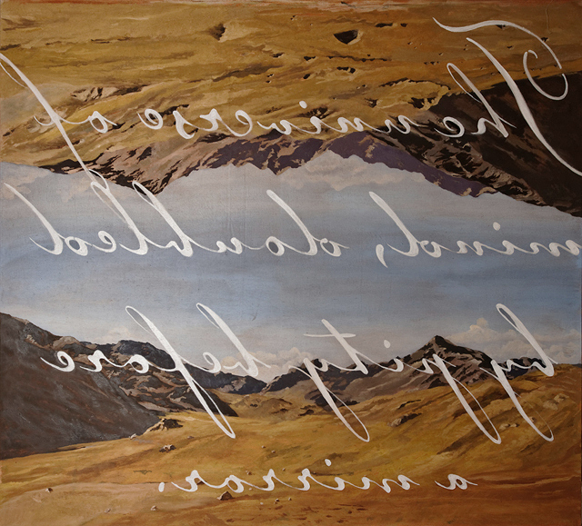
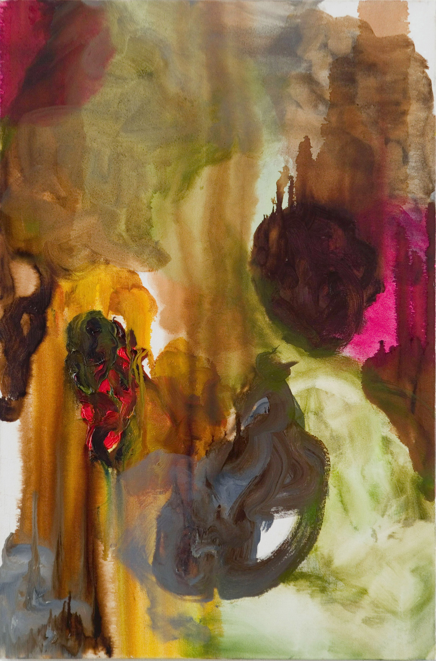
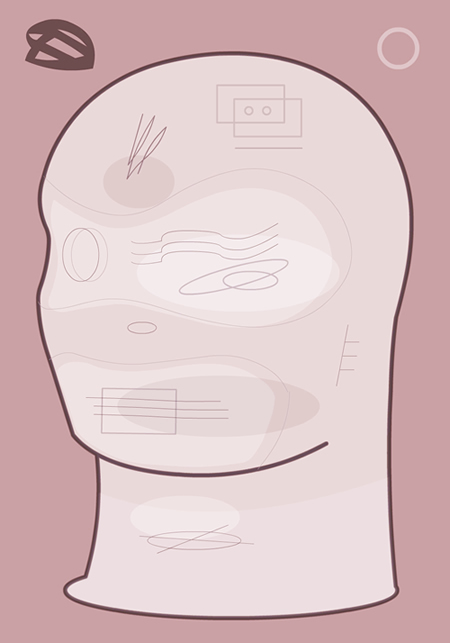
The Universe Of Mind, Doubled By Pity Before A Mirror; 2011-12; 66 x 72 inches; oil on canvas

I first saw Ayad Sinawi’s paintings a few years ago during a visit to his studio in Long Island City.  Working in a few different modes of  representation – at times cinematic, sometimes schematic and abstract – they evoke deep feelings of longing and a desire to connect with the viewer.  I recently visited his studio again and  I left feeling as though he had turned it up a notch in terms of pictorial ambition.  The following short interview talks about, among other things, some of  the overriding themes that pervade his work and his sources of inspiration.  

Art Blah Blog: You’re currently (mostly) using three modes of representation – the large, for lack of a better phrase, “cinemascope” pictorial paintings, the cloud grids, and the map-like overlays that are schematic and more akin to abstraction.  Before we go into any of these in any detail, do you encounter some conflict in the studio as to what you’re going to work on?

Ayad Sinawi: Firstly, thank you Andrew for giving me this opportunity to discuss my work.
As to your question, yes there is usually a little conflict every time I step into the studio, not because I’m conflicted about which painting (or type of work) needs my attention at that particular moment, but instead has something to do with the amount of time I can dedicate that day to my studio practice in general.
Working thematically and in series have always been a process I felt most comfortable within. I have iconoclastic tendencies and have resisted establishing a recognizable style from early on in my work.
Because I feel that the different themes in my paintings are component parts of the same puzzle of a unified vision, bringing the different elements together tends to define in my mind a co-dependency toward meaning. I feel liberated by not being consigned to a style. I owe a lot of that to my temperament as a painter, but also to being a student of the eighties at a time when postmodern skepticism was pushing painting, and art in general, to redefine the image in terms of pluralistic constructs.

ABB: In all of your work, I found it interesting that your color palette was very consistent between these modes, but was also aware of the different feelings that each evoked.  I assume that one mode is scratching an itch that the others don’t.  In our recent studio visit, you alluded to the fact that all of your work speaks about similar issues.  I’m assuming that you’re tackling the same subject matter from different, if complementary, sides.  Do you ever have visitors who can’t connect it all?

AS: My color palette has always been limited to values that evoke earthiness, decay, and nostalgia. I never forgot a statement a professor of mine made long ago about the use of oil paints, how painting with oils is like painting with the earth of the planet, how it invoked life. I liked his metaphor, and in many ways, it helped me solve the problem of color early on. It’s not a case of indifference to color as much as it is an ambivalence. I hope that the “emotionality” of color can therefore strike a chord of narrative meaning instead of being purely a synaptic response to what color ought to trigger in us emotionally.

I alluded in your first question to my different modes of working as complementary collaborations toward an attempt at unified meaning. I try not to tempt a thesis-like reading of why that is, but hope that I can invoke these relationships in terms of aesthetic responses that may hopefully illuminate a sense of connection in the viewer.

Fear Fury Aloneness and Love 2012-13 | 66"x72" | oil on canvas

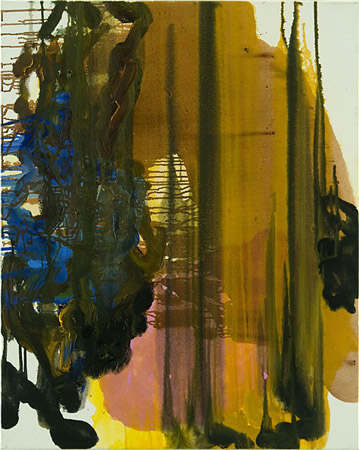
Fear Fury Aloneness and Love; 2012-13; 66 x72 inches; oil on canvas

ABB: I see a relationship of paintings like The Universe Of Mind, Doubled By Pity Before A Mirror to surrealist (Dali and Magritte) and some 80’s painting (like that of David Salle or Julian Schnabel, though better painted) in your use of reversed lettering and its doubled landscape.  I usually think of these kinds of paintings as emotionally remote, but your works are instead confessional and heartfelt.  Of course, the reversed lettering functions as a way of keeping the content at arm’s length, but not unreachable and, to my mind, imbues that confessional aspect with a sense of fragility.  The emotions in this piece and Fear Fury Aloneness and Love feel big and cinematic.  The lettering, in it’s flowing, arabic-like script, augments this sort of romantic worldview.  You’ve mentioned that these landscapes are composites of various sources, creating a kind of ideal place or dreamscape.  Would you talk about the process in creating these paintings?  Related, do you sometimes feel that your work is exposing?  I ask because many artists whom I know seem intent on keeping any emotional content out of their work altogether, or at least keeping it very peripheral.

AS: I wanted to use language in these paintings as a way to fold back one layer of interpretation back onto the image. I was intrigued by the idea of Plato’s cave as an allegory of our understanding of reality which seems even more timely today, and so I wanted to find some kind of a visual solution that was not didactic but personal. The mirroring afforded my a way to express that notion. By doubling the image on itself I was hoping to both suggest the allegorical cave, and establish a visual motif that suggests an opening/exit onto a different reality from the one projected behind us. There is a whole bunch of different interplays going on here: the scale of the painting, which you aptly suggested as cinematic, the relationship of the image to the body of the viewer, the interpretation of the allegory and our metaphorical departure away from the cave’s wall toward a new understanding of reality.
The reversed text adds another layer of meaning of course, because once again, its reversal is in itself a play on the idea of walking away and being able to read it in the rear view mirror after the fact.

I have to say that my intention was not necessarily to keep viewers at arm’s length. The reversed text was a way to merge narrative to image as an invocation of personal memory. Confessional or not, the viewer’s deciphering of what the reversed text said was my way of hopefully involving them in this merger.

The Color of the Sky Divided 2012-13 | 66"x72" | oil on canvas

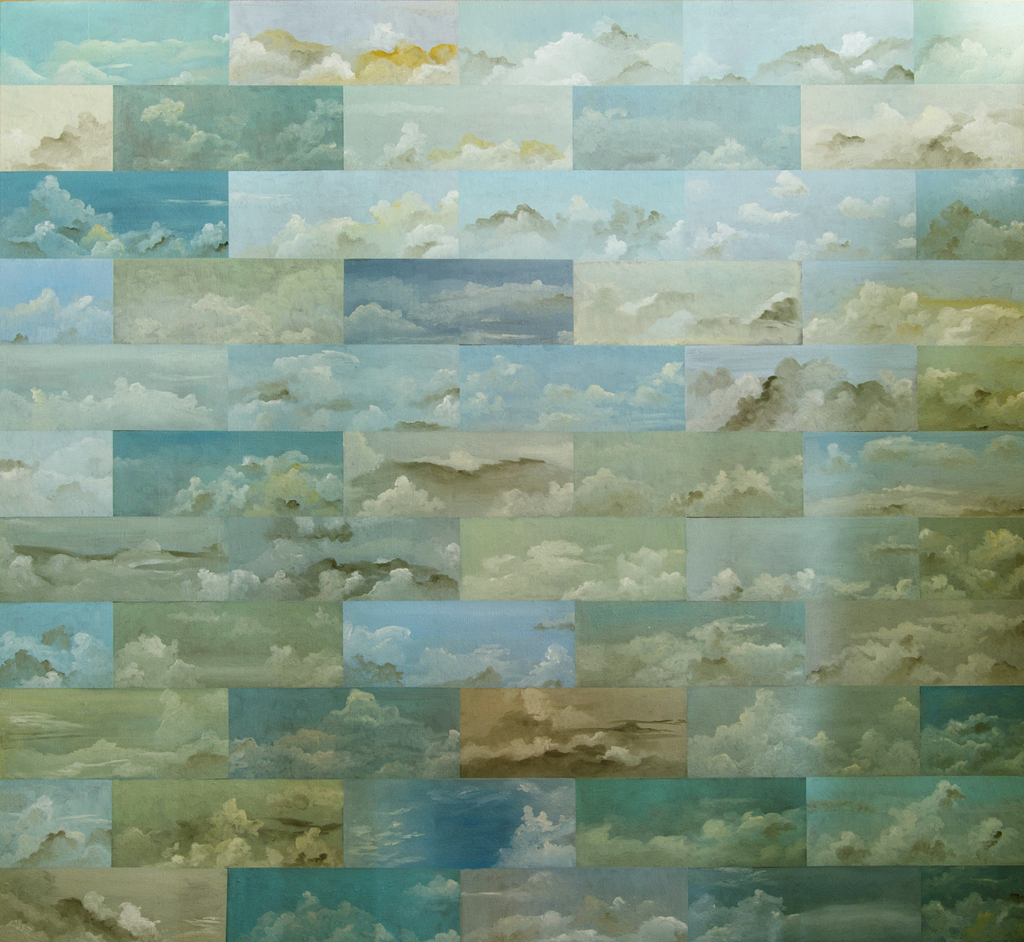
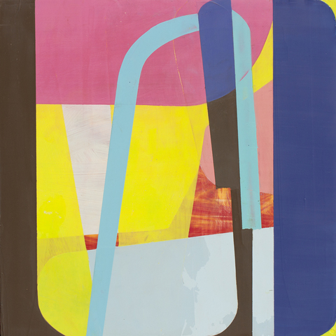
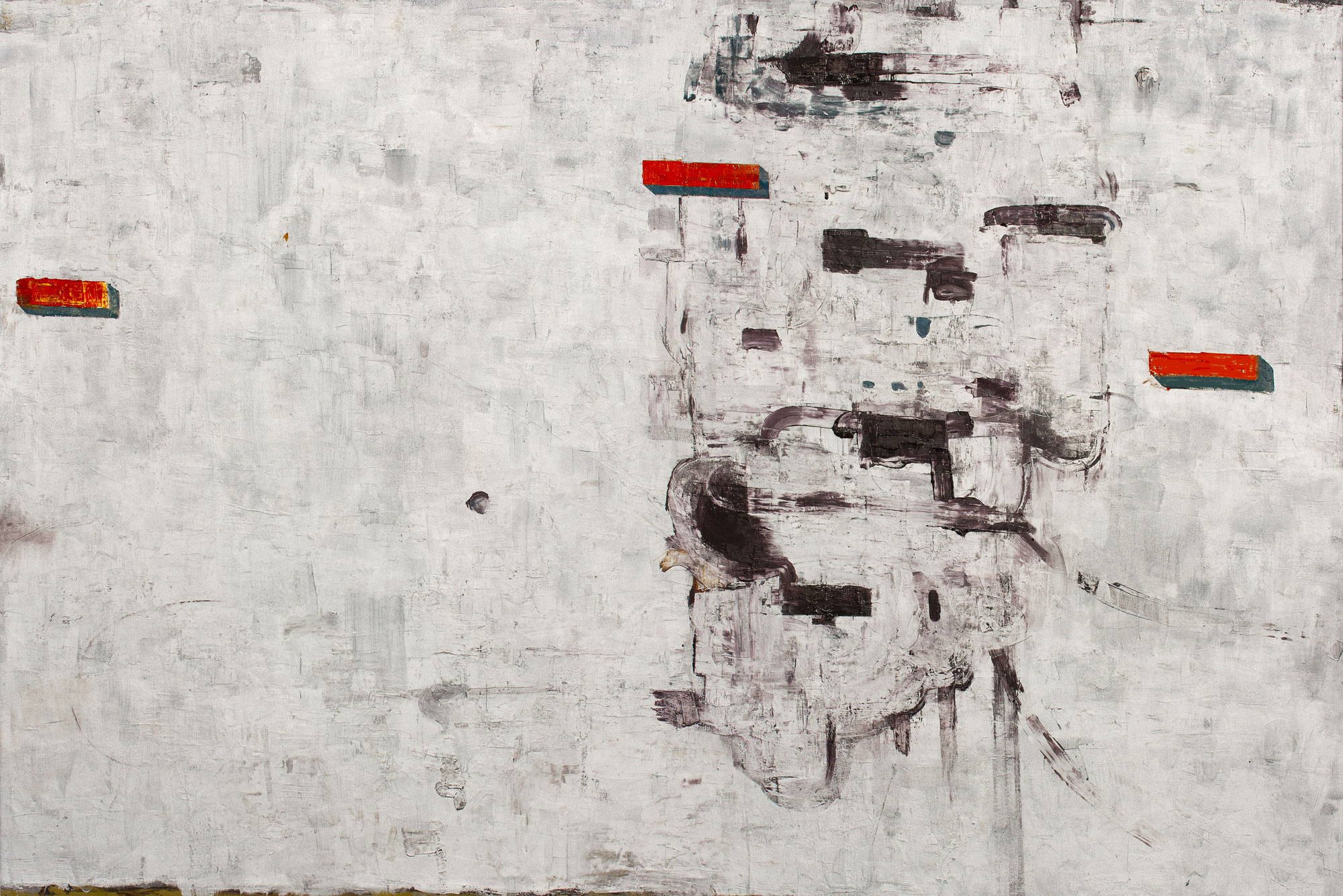
The Color of the Sky Divided; 2012-13; 66 x 72 inches; oil on canvas

ABB: The cloud grid pieces like The Color of the Sky Divided are fascinating to me, insofar as each rectangle is a cloud “world” that I could get involved with.  At the same time, there is a tension in wanting to look at the adjacent rectangle, and so on.  During our recent studio visit, I commented that the clouds have associations of freedom and dreaminess, but that by having these all gridded, they could also be read in terms of suffocation or imprisonment.  What do you think of this interpretation?  Would you also talk about where this cloud imagery comes from and what experiences inform these images?

AS: The grid structure was the only way for me to move ahead with making these paintings. I don’t think I would have been interested in a painting depicting clouds without defining the image via plurality and repetition. You hit it on the head about the duality I was after in making these images. The temporal non containment of how a cloud actually behaves, versus how I force the images to co-exist inside a rigid grid structure, both window-like and container. These clouds are imagined scapes made from observations but are never fixed to an actual image. I observe and I photograph the sky constantly, but rely solely on memory and gesture to “sculpt” the cloudscapes into place.

I do however disagree with the notion of imprisonment and suffocation. Locking the image within a series of gridded paintings are instead a way of observing things that are temporal and unfixed otherwise. Clouds are just another aspect of experience and memory as invoked by its own self-referential ubiquity.

Trieste Unknown 2013-14 | 30"x 28" | oil on canvas

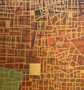
Trieste Unknown; 2013-14; 30 x 28 inches; oil on canvas

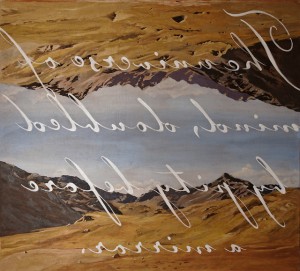
ABB: Well, it’s sort of becoming an Art Blah Blog tradition that I interpret work differently than what the artist intended!  That said, the map paintings like Magical Thinking seem more hard-headed to me.  With their overlays, they bring up associations of, say, the way a city might evolve from one century to the next, of streets and people discarded and displaced.  I also thought about the experience of someone’s lifetime – moving from one city to another. 

AS: Here is another literary source that although I read many years ago, was a foundation for how I wanted to explore the grid paintings. That book was Italo Calvino’s Invisible Cities, and the notion of the imaginable in literature stuck with me as I tried to find a way to put an almost literal and diagrammatic element to play alongside grids and lines that has had a long history within modernism’s fascination with geometric abstraction.

Obviously, the links I make to city grids are self-evident, and there has been for me a long period of fascination with cities as evolutionary organisms. The stacking, layering and the interweaving of grids are metaphors for added experience that are both personal and corporeal. I was interested in manifesting those ideas by making the actual doing of the paintings the subject of their meaning without stuffing the work with opaque theoretical foundations. If I dare to say it, the meaning is in the action of doing.

ABB: On a related note, you spoke about about how your work was sort of a outgrowth of the classic immigrant experience, a result of a peripatetic early life.  Especially in the large cinematic pieces, it occurred to me that you were creating paintings of places where you could feel a sense of home or belonging.  At the same time, there seems to be an effort to talk about a sense of disorientation as well, a tension between that ideal and its attainment.

Magical Thinking 2013-14 | 30" x 24" | oil on canvas

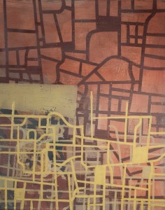
Magical Thinking; 2013-14; 30 x 24 inches; oil on canvas

AS: Painting is a way of fixing location and defining for me what belonging is. I always saw the act of painting as a political act in as much as it declared a free will to explore and process ideas of “home” and my personal freedoms to engage with the world around me. As a child growing up in the Middle East, that would have been unthinkable had I stayed. However I am not making political work at all. I don’t even consider my work as diaristic in narrow specific terms. I aim for beauty and materiality, I take pleasure in throwing contrasting motifs against each other and seeing what happens (or doesn’t happen). I like to doubt myself because that is how I arrive at answers. It frees me to work poetically and rigorously, but without the deep filter of self-editing.

ABB: Have you seen any shows of late that impressed you?

AS: One exhibition that stayed with me was Kour Pour’s painstakingly detailed large scale paintings of Persian and near Asian carpets at Untitled. They are labor intensive recreations of photographic sources from various European and American auction catalogs. They not only act as simulacrum of the real thing, but bring to focus our relationship to marketable commodity versus functional and humanistic utility in beautifully direct ways. They also spoke to me about how direct experience can sometimes lead to a reinterpretation of the familiar. In Mr Pour’s case, he grew up surrounded by Persian carpets as his father was a carpet dealer in England, so the images are rife with personal meaning as well as the social and cultural dimensions associated with such an economic pursuit.

ABB: You’ll be showing three paintings at Jeffrey Leder Gallery* as a part of the group show, International Painting NYC III (opening Sunday February 23, 2014).  Any other shows on the horizon?

AS: I am exploring different avenues to exhibiting my work abroad, but I’m currently more content to make the work and explore scale and gesture within the confines of a studio practice unencumbered by expectations and deadlines.


*Jeffrey Leder Gallery is located at 2137 45th Road in Long Island City, NY; Phone: 917 767 1734; http://www.jeffreyledergallery.com/

To see more of Ayad Sinawi’s work, go to: http://ayadsinawi.com/

All images copyright© Ayad Sinawi

Grow Rich While You Sleep: An interview with Jeff Feld

Jeff Feld; The intention is pure and so on; 2012; Cardboard, latex

Jeff Feld; The intention is pure and so on; 2012; Cardboard, latex

I first became acquainted with Jeff Feld’s work during a Bushwick open studios when he opened his house/art space in Ridgewood to visitors.  Most prominently displayed were his cardboard sculptures which I immediately took a liking to.  After speaking with him for awhile, he generously shared a number of other projects – drawings, paintings, collage, and other sculptures that often used materials in an inventive and unfussy way that evoked a sincerity and formal accomplishment.  I confess that I found it difficult to wrap up the raft of associations in a tidy package – which I believe to be the point.  To quote from his artist’s statement, Feld’s work “…attends to and embraces the vicissitudes, banalities and failures of the day to day.” .  This short interview doesn’t pretend to discuss Feld’s work in a comprehensively detailed way, but instead tries to provide a general overview of his thinking and process.

Jeff Feld; A failure of the day to day (Front view); 2014; Inner tube, concrete

Jeff Feld; A failure of the day to day (Front view); 2014; Inner tube, concrete

Art Blah Blog: You seem to get a satisfaction out of using fairly humble found materials for your work – foam rubber, wallboard, cardboard, office envelopes and the like, and repurposing them as artwork of various kinds to express an uncomplicated but pleasing abstract sensibility, as well as a kind of connection to the larger world. Can you take me through your process a bit? Does it involve trolling dumpsters, building sites or Home Depot with specific thoughts as to how these materials might be used?

Jeff Feld: Hi Andrew, thanks for inviting me to speak with you on your art blog. It’s always fun running into you out in the trenches. I’ve never trolled a dumpster for art.  That being said, I like the whole idea of dumpsters as objects in general because, like this interview, they provide a context for collision and exchange of meanings.  Dumpsters have a lot of material but I rely on local hardware stores and art supply stores, mostly, and buy what I need in a very prosaic, law-abiding way. Given the nature of my work there is sometimes a question as to where my hand interceded versus what existed before and I like this unintended consequence.

There is an emphasis on material in my work. It’s not so much that I get satisfaction out of these materials, but rather that I’m interested in materials and use them to express or reveal a particular feeling and meaning. I’ve always used materials in this way. Certain bodies of work required a high degree of skill.  For example, the hand sculpted and cast earthenware used in “Service Station,” or my work “Pelican” in which I meticulously recreated a Rauschenberg performance.  My holy water works use a sacred substance to recreate images of the Madonna and child on large pieces of industrial sponge. Godliness is next to cleanliness.

I use materials that I feel are consistent with the type of space – emotional, physical and literal – that I want to create. Pleasing, uncomplicated, dumpster diving – I wouldn’t associate any of those terms with my work, or with my central interests.  For the last couple of years I have been thinking and making work about the banality of everyday life and the failures we encounter daily.  We find ourselves confronted by dysfunction and surrounded by materials that are ubiquitous, cheap, and transitory. My use of cardboard, concrete, spray paint, and so on, are very much consistent with the day–to-day experience I share with millions of others. These materials do provide a connection to the larger world but, more importantly, they provide an entry point for the viewer to experience something that is larger than what I present. These associations allow for discourse that expands outside of the gallery and over time.

Jeff Feld; Stop and frisk; 2013; Altered wooden barrier

Jeff Feld; Stop and frisk; 2013; Altered wooden barrier

ABB: My take is that the materials keep throwing the real world back at the viewer, so that we become involved in a chain of associations outside of the usual “art world” concerns. There seems to be a sort of tragicomic content in your work, specifically in works like A failure of the day to day and Stop and frisk that have an implied sort of narrative. Would you expand on this?

JF: I’m not really interested in the usual art world concerns in that I really don’t know what they are anymore. I would acknowledge that in the past I’ve probably pushed my work in an art world direction that seemed to be somewhat cogent to me but I think for me it is better to invest my energy into Jeff Feld concerns. From my viewpoint it seems that as visual artists we operate under the increasingly large shadow of language and money and in many ways these pervert the essence of how my work functions. How often have you had a curator come into your studio, spend a few moments and then ask you to tell them what the work means? These are people who are supposed to know something about attending to and discerning meaning!  I give the viewer an in, and perhaps a context clue, then the rest is up to you. I’m not saying that I don’t like talking about the work, but viewing art is not a facile enterprise. While I have produced works – most recently a project I did with the Queens Museum of Art entitled Queens takes Kings – that clearly rely on language and interpretative materials, on the whole I prefer producing works that are less dependent on a fixed narrative that gives them meaning. I want my work to exist and have meaning in and also outside the white cube. When I choose a title for a work my aim is simply to set a mood, perhaps give a little push, but not in a singularly prescribed direction.

Jeff Feld; Two truths ocurring at the same time; 2012; Routered homosote

Jeff Feld; Two truths ocurring at the same time; 2012; Routered homosote

Tragicomic is a good word to describe my current work.  The confounded condition of the things I make resonates with what I observe in the world. I wouldn’t say that the work is narrative based, but rather that the work is socially based, it speaks, to social concerns, the problems of all manner of relationships in everyday life, the constant falling short of expectation, and the shifting meaning of the objects we encounter.

ABB: On a related note, your work seems “friendly” to me, but not “cute”. Do you find that your use of found materials keeps the aesthetic a bit more grounded, a bit grittier? In particular, the small collages that you make have a sweetness to them, without being sappy. Do you sometimes step over the line and destroy a piece if it goes over a particular line? Related to that, are there any particular reasons that would make you destroy a piece (besides accidentally dropping it)? How much revising do you typically need to do?

Jeff Feld; 2012

Jeff Feld; 2012

JF: The only found materials in my work are used inter-office mail envelopes that I take from my day job.  I guess, technically, they could be classified as stolen objects. I’m phasing them out but I like these envelopes because they provide a record of interaction among people and as such serve as indexical devices. My drawings provide an index of interactions between myself, materials, and space. My drawings have no corners, I trim the corners into a rounded edge. This decisive act creates a defined space, and alludes to an object of containment. I only destroy work if it becomes exhausted of meaning (for me) and I can’t remember the last time that happened. I’ve had a dog destroy my work with great gusto and pleasure as well as a critic or two but that’s it.   I change works, though; everything before me in the studio is malleable in some way and I think the ability to push something in a different direction rapidly without fear is essential to my studio practice. I wouldn’t come to blows about adjectives, but my drawings don’t evoke friendly and sweet for me.  I think their scale and materiality make them human; like us mortals, the drawings are subject to duress but are resolved, after struggle, and become true to themselves.

ABB: When I visited your space, the series of painted cardboard sculptures, The intention is pure and so on… looked to me as though they were made out of wood. I was surprised to find out that they were cardboard. Most of your stuff is very up front about what it is made of. The disguised aspect of these specific pieces seemed part of a larger strategy, but I’m not sure if I completely understood the intent, though I found the disguise itself intriguing and I appreciated the work formally. Was there an element of enjoyment in putting one over on the viewer, and/or was this disguise part of a larger theme for these pieces?

JF: To talk about a work in only formal terms is a canard. I don’t think we can ever separate form from content. The works that you describe are very interesting to me in the context of my broader work as I view them as transitional works, moving through a slow and labored, “smart” approach through to my current work, which is immediate and decidedly dumb. The works that compose “The intention is pure and so on….” hint at modernist forms yet have no specific reference point – instead they seem castoffs from the larger modernist project, long forgotten yet somehow evocative. These hollow works are fake in the sense that their histories are created in the studio and the use of cardboard belies this falseness. I’m not trying to put one over on the viewer but instead bring an idea, that the modernist project is empty and over, into three-dimensional form. The title speaks to earnest ambition yet it negates itself.

Jeff Feld; We Buy Gold 1; 2014

Jeff Feld; We Buy Gold 1; 2014

ABB:  Just a couple of obligatory questions to end the interview. Were there any shows that impressed you lately?

JF: There is so much out there to see that I can hardly keep up. Out my way in Ridgewood/Bushwick,  I really appreciated Meg Lipke’s work at Parallel, Meg Hitchcock at Studio 10 and Dave Hardy over at Regina Rex – I’m still thinking about Dave’s show and it’s been a few months, looking forward to seeing how his work progresses.

Two stand out shows for me were -Stay in Love, organized by Chris Sharp and Tony Feher at Sikkema Jenkins. Stay in Love took place in two galleries, Laurel Gitlen and Lisa Cooley.  The show resonated with me in every way and included a super great B Wurtz work as well.  Tony Feher at Sikkema and Jenkins was gorgeous – I’ve never given Tony’s work a whole lot of thought but I thought this show was beautiful and evocative, I’m thinking about him in a whole new way. These powerful works were articulated using an economy of means that I truly admire.

ABB: Do you have any shows coming up soon?

JF: Maybe, sort of, kind of – and then again perhaps not – I’ll share some details when I can.

Interviewer’s note: the title of this interview courtesy of Jeff Feld.

Jeff Feld; Grand Re-opening; 2014; Concrete, pennant

Jeff Feld; Grand Re-opening; 2014; Concrete, pennant

All images copyright© Jeff Feld.


The Artist’s Husband Speaks: Suzanne Laura Kammin “Greater and Lesser Vehicles” at the Painting Center; Opening this Thursday, January 30th, 6-8 PM

intransitThere may be times when artist Suzanne Laura Kammin wants to deny that she is married to me (like when I’m being critical of other artists on this blog), but I have the marriage license to prove otherwise, so I feel pretty secure for now.

It would be difficult to be married to an artist whose work I didn’t like,  so I’m grateful that I respond so strongly to her paintings – work that feels very open, expansive and beautiful.  For all their bright color and sense of play, they are quite rigorous and deep in a way that is all too rare.

So I hope that you will join Suzanne at the opening of her show, Greater and Lesser Vehicles at the Painting Center in Chelsea this Thursday 6 – 8 PM.  Suzanne is sharing the main space with Marianne Gagnier, her show titled Of This World.  Ro Lohn’s Snow Paintings are in the project space.  Lots to see, lots to love.

Congratulations, Suzanne!

The Painting Center is located at 547 West 27th Street, Suite 500 New York, NY, 10001

Greater and Lesser Vehicles runs January 28, 2014 – February 22, 2014. Opening: This Thursday, January 30th 6 – 8 PM

Gallery Hours: Tuesday through Saturday, 11:00 – 6:00pm

http://www.thepaintingcenter.org

Interview with Richard Staub, agent of disturbance

Towel; 2012; paper, tape; 72 x 25 inches

Richard Staub; Towel; 2012; paper, tape; 72 x 25 inches

I first met Richard Staub through mutual friends who described his work as alternately beautiful and unsettling.  Some time later, I was fortunate enough to visit him in his studio in Brooklyn.  What follows is a written interview where he discusses the scope of his work and ideas regarding his choice of materials, the latter of which I find provocative, brave, and a little disturbing.  I am led down some dark paths when I contemplate the various fruits of his expression.  He and I differ our interpretations his work, his own attitude being quite matter of fact, even blasé.  He has a point – much of his work concerns the very stuff that glues our lives together.  Literally.

Art Blah Blog: You do many kinds of work – paintings, sewing, collage, sculpture.  When you go to the studio, do you have an idea as to what you’ll be working on that day?  Do you ever feel conflicted about what you “should” be working on?

Richard Staub: Since I make work both at home and at the studio, what I work on and when is determined by where I am and the kind of work I do there.  Whichever space I’m in, I rely on intuition regarding what to work on.  And I often leave the studio in the evening with an understanding of what next step to take on one of the pieces when I return.  At the studio, I’m working on a series of paintings that I’ve started over the last several years and are waiting for completion. (There are also some taped plastic pieces underway.)  I only paint at the studio and since I get there just two times a week, I have a warm-up procedure which includes working in my notebook, straightening up anything that feels out of place, and just looking at work or reading the newspaper.  Then I see where I can make the next move.

My biggest “should” is to do more painting, but I’ve come to realize that making the other work that has a stronger physical presence is part of the process of internally digesting what a painting may need.  And some of the taping and sewing work involves repetitive, calming steps that are helpful in focusing.

Richard Staub; Grey Top; 2009, oil on canvas, 36 x 24 inches

Richard Staub; Grey Top; 2009, oil on canvas, 36 x 24 inches

ABB: It’s my understanding that you started to make art primarily as a painter.  When did you start making the other kinds of work?  Did you feel that they scratched an itch that painting did not?  If so, how?

RS: I did start as a painter when I was a student at SVA in the early 70’s and my main conscious drive was to understand color and paint following the example of the AbEx painters.  Along with that was an emphasis on process but I had very little awareness of its implications. For example, I eventually started to use more chance procedures to open up a piece.

Fairly early on I started to make more three dimensional work (I was looking at how to make drawing occupy an open space) and sculpture.  I felt very uncomfortable making large, solid pieces so my sculpture for the most part consisted of pieces with a wire armature and form covered by plaster cloth and then painted.  Today most of my pieces, while some may occupy a large space, are in fact very light and collapsible.

In the early 80’s I started thinking about an SVA studio class that I’d been too apprehensive to take when I was a student.  The exercise I heard about, transform a piece of clothing to reveal something about yourself that no one knows, was an eye opener for me because I was both attracted to the idea and afraid.  I knew what I would have done, and that it would be an important step to take.  A piece by Louise Bourgeoise in her mid-career show at MoMA was very helpful in that regard.

So I decided to work with the materials I would have used for that piece and make something that felt true to the current moment.  And all of the non-painting work came out of exploring the desire to explore spaces that I’d kept hidden.

Richard Staub; Flesh Tones; plastic, thread, cloth; 36 x 12 x 9 inches, 1996

Richard Staub; Flesh Tones; plastic, thread, cloth; 36 x 12 x 9 inches, 1996

ABB: Some of your work has an unsettling vibe.  Within that category I would place the wig pieces, the plastic bag sculpture pieces, and the collages – all of which seem to encompass (among other themes) ideas of humans as a kind of waste product.  Admittedly, some of these have a “warmer” feel than others, but they seem to exist within a continuum that I’ll call “the horror of human existence”.  On the other hand, your paintings are quite romantic in their use of color and gesture, at times having an elegiac feel.  Formally, they’re certainly very different.  How do you deal with that in the studio?  Are there different intentions behind your different kinds of work?

RS: The perceptions and “ideas” behind the work you’ve articulated aren’t shared by me.  At different times I felt I had to move towards materials that were considered in poor taste to go against my upbringing in a very restrained emotional and physical environment.  I’ve been interested in found materials, “waste” materials, bodily fluids, etc. for quite a while.  I like how I find them in the world, their everydayness.  In all cases, I want the work to have a visceral quality. All of the pieces reflect shared interests in revealing and concealing, veiling, rising and falling, containment, compression and expansion, and the formed and unformed.  The materials may be unsettling to some, but the there is a continuum of expressive impulses.

Richard Staub; Red Tress; hair pieces, thread; 2.25 x 4 x 7 inches; 2001

Richard Staub; Red Tress; hair pieces, thread; 2.25 x 4 x 7 inches; 2001

ABB: Related to the last question, do you worry that the scope of your expression makes it difficult for curators to get a bead on your work?  Or do you find that curators see more possibilities for your work because you’re not locked into one medium? 

RS: It is sometimes is a concern. But every time I show the work I see that while different kinds of work speak to different people, they pick up on the continuity of interests among the different groups.   I’m not sure if curators see more possibilities for my work.  It was true of the last show I was in, which was a group show on contemporary drawing.  There were several groups of pieces the curators were interested in, but in the end they could only show one piece.  It was a very large sewn net that I feel held its own.

ABB: Were there any shows that you were especially impressed with lately?

RS: I was very impressed by the “Come Together, Surviving Sandy” show at Industry City in Brooklyn where I have my studio.  The level of work was very high and provocative throughout.  It was tremendously encouraging to see the quality of thinking and exploration that’s happening in the city. I should add that with a close to full-time day job, I don’t get to see much work – it’s either going to galleries or being in the studio – so this show felt like a very satisfying meal for a hungry man.

ABBAre you showing anywhere soon?

RS: I will be participating in an open studio day on April 26 at Industry City and showing a representative group of pieces.

Richard Staub; Heated Pink; oil on canvas; 30 x 24 inches; 2008

Richard Staub; Heated Pink; oil on canvas; 30 x 24 inches; 2008


All images Copyright © Richard Staub

http://www.richardstaub.com/

Shameless Self-Promotion: All That Glitters at Gateway Projects – Opening this Thursday, January 16th from 6-9 PM

Reaping the Whirlwind, oil on canvas, 56 x 84 inches; Image copyright Andrew Baron

Reaping the Whirlwind, oil on canvas, 56 x 84 inches;
Image copyright Andrew Baron

Link:https://www.facebook.com/TheGatewayProjectNewark#!/events/1433124896918526/

I hope to see you this Thursday January 16th from 6-9PM for the opening of ALL THAT GLITTERS at Gateway Projects in the city of tomorrow, Newark NJ.  I will be exhibiting the above painting, Reaping the Whirlwind.

Curated by Rebecca Jampol and Athena Barat, All That Glitters is a group exhibition about abundance, luxury and decadence, flirtations with vulgarity, and the ache for exaltation (actually, my piece is specifically about karma and payback, but it sort of fits and it is in beautiful silver).  The show runs through March 20, 2014.  Please try to make it!

Exhibiting Artists :
WILLIE COLE – www.williecole.com
RYAN TRECARTIN – http://www.eai.org/artistTitles.htm?id=12077
KATHERINE BERNHARDT – http://www.saatchigallery.com/artists/katherine_bernhardt.htm
SHOPLIFTER – http://shoplifter.us/
AKINTOLA HANIF – http://www.hycide.com/
MARY ANN STRANDELL – www.maryannstrandell.com
SHOSHANNA WEINBERGER – http://www.shoshanna.info/
RAUL DE NIEVES – http://rauldenieves.tumblr.com/
KEVIN SAMPSON – http://www.folkart.org/mag/kevin-sampson
RICHARD WISLOCKY – http://www.richardwislocky.com/
ALEXANDRA DESIPRIS
MARY EDNA FRASER – http://maryedna.com/
AYANA EVANS – http://ayanaevans.tumblr.com/
ANGELINA DREEM – http://angelinadreem.net/
ANDREW BARON – http://www.andrewbaronstudio.com/
ASHLI SISK – http://ashlisisk.com/
BRENDAN MAHONEY
BENJAMIN PHELAN – http://www.benjaminphelan.com/
ERIC BARRY DRASIN – http://www.ericbarrydrasin.com/
FERNANDO MONTIEL KLINT – http://www.fernandomontielklint.com/
HANNAH CRAFT – http://hannahcraft.com/home.html
KATYA GROKHOVSKY – http://www.katyagrokhovsky.net/
JESSIVA BOWMAN – http://jessica-bowman.com/
MELVIN JONES
NDA
LABANNA BABALON – http://www.youtube.com/user/labannably
LUCA CUSOLITO – http://www.lucacusolito.com/
SID ART  http://www.studio2012.info/profile/SDARTMETA?xg_source=activity
WHITNEY LEA SAGE  – http://www.whitneysage.com/

Performances Opening Night by:
COLIN SELF and CHEZ DEEP – https://www.facebook.com/ChezDeep
http://www.papermag.com/2012/10/colin_self.php
KATYA GROKHOVSKY
& AYANA EVANS
 

Michael Amter: Visionary

Michael Amter (Artist); Defined, limited print - 20 x 14 inches; 2011

Michael Amter (Artist); Defined, limited print – 20 x 14 inches; 2011

Fall From Grace (Sample)
東京

I first became acquainted with Michael Amter’s work a few years ago when I had a solo show at Gallery Aferro in Newark, New Jersey.  He had a video showing upstairs while my show of paintings was on the ground floor.  I get bored in galleries pretty easily, and art videos seem to push my patience past its limit.

But Amter’s work was different.  These were not the usual slow-moving, easily dismissed art videos.  There was a whole set of cartoony symbols and relationships in his tightly edited work that made a kind of strange, sometimes creepy sense, though I could not precisely decode them.  I also could not stop watching.

The first link, Fall from Grace (sample) is a very short clip from his piece Fall from Grace that he showed at Gallery Aferro in his later solo show of the same title in 2011.  This exhibition was mesmerizing – it not only included the aforementioned video, but numerous graphics and ink drawings that had a painter’s touch fused with a love of comic and animation art.  The show investigated his issues pertaining to his manic depression by couching it in a mythic good vs. evil framework.  With its artful repetition of key images that were both cute and threatening, I felt as if I had walked into a world that inspired both paranoia and a childlike delight.

The second link, 東京, is a short video that uses music of Maki Kinoshita.  It’s a more stripped down work than the aforementioned “Fall from Grace”.  Its spare, melancholic beauty acts as a cathartic meditation on the passage of time and space.

I’ve used words like creepy, paranoid and melancholic to describe Amter’s work and these are all apt.  But while these characteristics would seem to point to a very closed down, oppressive experience, the work is instead peculiarly open and mind-expanding.  His work should be a bummer.  It’s anything but.

For more examples of Michael Amter’s work, please go to: www.michaelamter.com

His video work can also be experienced in various permutations on YouTube

Merry Christmas!

Merry Christmas Everyone from Art Blah Blog!

Below is an installation shot of Greg Leshé’s piece, Sympathetic Vortices from 2011.  Pretty ferocious.  All they need is a little bit of love.

Greg Leshé (artist); Installation of Sympathetic Vortices,  2011; Copyright the artist; Image courtesy of the artist

Greg Leshé (artist); Installation of Sympathetic Vortices, 2011; Copyright the artist; Image courtesy of the artist


Apexart unsolicited proposal winners announced – loser appalled by soulless proposal writing!

Apexart, a non-profit gallery in lower Manhattan, annually accepts submissions for curatorial proposals for the following year.  The submissions for 2014 were judged by 130 international judges and the top three proposals as determined by vote were then awarded a show.  525 proposals were submitted.

Full disclosure: I submitted a proposal that was not among the winners.  Beyond the typical rejection email, the people at Apexart let you know where your proposal was ranked.  Kind of nice, though others might see it as an act of cruelty.  My proposal was not in the top 20 or even upper half.    I was tied with about 30 other people at number 483.  Not sure how I feel about that – if I’m going to lose, I would like it to be exceptional in some way.

Given the amount of entries, I am not especially disappointed and I have nothing against Apexart.  Quite the opposite – the application was mercifully easy to complete and there was no fee to submit (a rarity).  I found the whole endeavor to be commendably administered, in fact.

But I was appalled by the tone of the proposal that came in first place (titled “As Above, So Below”) .  Here’s a pithy sample of the last paragraph of the winning entry:

“…However, the exhibition seeks not only to critically reflect on this socio-spatial shift, but also to give prominence to the potential for de-colonizing the aerial space itself, and hence, the aerial point of view. Through a series of workshops and talks, hosted by activists and thinkers, the project will offer practical DIY skills and proposals of how to re-conceptualize the air space as ‘commons’ and to reclaim the sky through social and collaborative practices.”

I feel dirty reading it.  It hits all of the hip socio-political grace notes and couches them in a bloviating, academic/bureaucratic-speak that’s just too perfectly slimy (so perfect that it resists parody).  I’m perplexed: Who would possibly vote for this?  Does this language really excite people?  Or did the judges vote for this proposal in spite of the smarmy, soulless writing?

A fellow commiserator wrote to me, “Better hope they get lucky with some worthy artist who turns fashionable diatribe into something sound by exhibition time.”

Excuse me, I must now re-conceptualize my own personal air space as ‘commons’.  Through social and collaborative practices, of course.

Why I’m writing this…

When I first thought of writing this blog, I looked around at other artists’ blogs and found the results a bit wanting. The tone that I encountered was and remains typically uncritical, where a kind of vague cheerleading acts as a substitute for saying something meaningful.

This uncritical tone ensures that the artist blogger does not offend any fellow artists, an arts organization or most important, a gallery.  As one artist told me, his blog was really just a networking tool, a way to meet as many artists as he could and thereby ensure that people “knew” him. He would then feature their work on his blog and they would then include him in group shows, introduce him to people they knew, etc., etc.

This strategy makes excellent career sense, but in terms of saying something insightful, it’s essentially just one more empty plastic bottle in the internet landfill.

I am hoping that Art Blah Blog will be something different.  Certainly, as an artist I have my own career ambitions, and I am not free of my own conflicts of interest (which I will disclose as they come up).  That said, this is a space for my own criticism and advocacy that I offer without apology.  I hope to write about work that I believe has great value, but will write about that which does not from time to time.  In fact, writing about work that I find meretricious (a fancy word for “prostitute-like”) is a guilty pleasure of mine.

When I broached writing this blog to other artists, I mentioned that I had avoided it due to my unwillingness to alienate my colleagues.  One said that she thought it would be refreshing, another said that it might help me meet like-minded people.  We’ll see about that.

Join me.